
Week 4: Colour Theory
This week I'll be leading you through a few areas of colour theory that I have found to be extremely helpful in my endeavor to deepen my understanding of colour. To start with, here is a breakdown of a colourwheel and common terms given to various colour selection configurations. It's worth familiarizing yourself with these configurations and terms, especially if you are planning on entering the world of design.

As an introdution to colour, have a look at this video. It gives a good overview of how colour interplays with our lives. As image makers, developing an understanding of how colour can influence and reflect tone and emotion is vital to communicating visually. So have a watch of this video and take some notes!
Colour is a very powerful complex system for communication. Beyond the basic understanding of what colours you need to blend to achieve other colours, having an understanding of how colour can influence our composition and narrative is a very powerful tool. The following video delves in to this area of theory in a very simplified way. If you watch nothing else this week, sit through this video. It is well worth it
As a good introduction on how to plan applying colour to our imagery is this following video by Sycra. It gives a good overview of how limiting your options with colour, can help to create powerful imagery.
EXERCISES
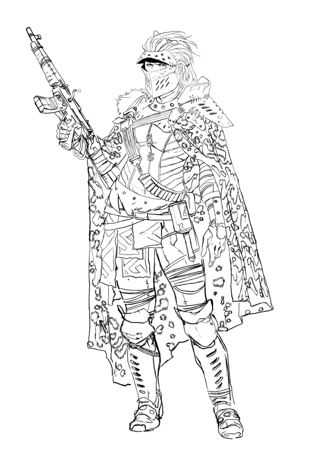
In this weeks class, we will be looking at several tools in photoshop that can help us to understand and manipulate the colour pallettes that we are working with. Also i'll take us through a small colouring exercise. Here are a few character designs by one of my favourite artists Marko Djurdjevic (if you aren't familiar with his work, look him up, he is awesome!). Select one of these and we will be using them to practice our value and coloring skills.


Another exercise that is worthwhile in order to understand colour application is to study the works of great painters in a similar fashion to how we did value studies of black and white images last week. The process is pretty simple, find and image by an artist you like (preferably who works with realism) set up a canvas in Photoshop, and look to examine the colour palette, colour composition and choices they made.
Here's a great video by Anthony Jones that goes in to some detail about doing studies of other artists. He's someone definitely worth following!